Whoever said ‘don’t judge a book by its cover ‘ never had to sell one. This is the boring story of the cover design of my book. How it started, where it went, and how it ended. Exciting stuff!


So, I knew I needed a kick-ass cover in self-publishing my first book. I scouted a few places that did professional book design. And, of course, they charged an arm and a leg to have a polished, professional-looking book cover. I decided to make it myself and to look for a stock picture that could convey as best it could the mood of my book. I chose this one.

It’s a nice picture of a house taken during the night. My book is a thriller/horror (it could technically fit both categories) about a home invasion. It was good enough. However, after I downloaded the picture on Amazon’s Kindle book cover templates, the software didn’t like it. The picture’s format didn’t fit the model I chose for my book cover, and so I had to settle for this book cover.
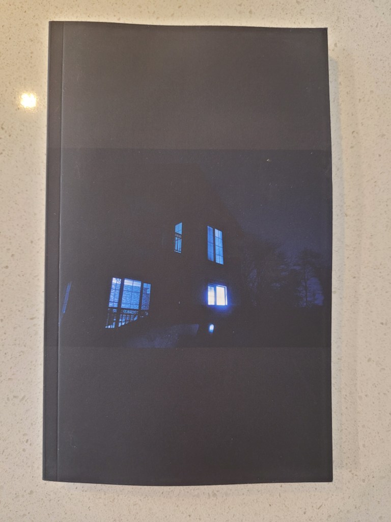
I initially liked it, and I thought it was unique, but I was delusional. How can you have a book without its title on the front cover? That will not fly on bookshelves!
After opening an account on Barnes & Noble, I was pleased to see that their book cover templates did accept my picture. I was then able to insert the title on the front cover. And this is the result.

I then used this template on Amazon Kindle, and to my surprise, it accepted the format. I later changed the font because I found this one to be too soft for a thriller. FYI, the printing quality of Barnes & Noble is better than the quality of Amazon. But Barnes & Noble does not send author copies to Canada. And buying my books full price was not an option economically wise.
Scouting bookstores here in Montreal for consignment contracts, I soon realized that ordering my printed copies from Amazon was not the way to go. The quality was not good enough to compete with the beautifully printed books of publishers.
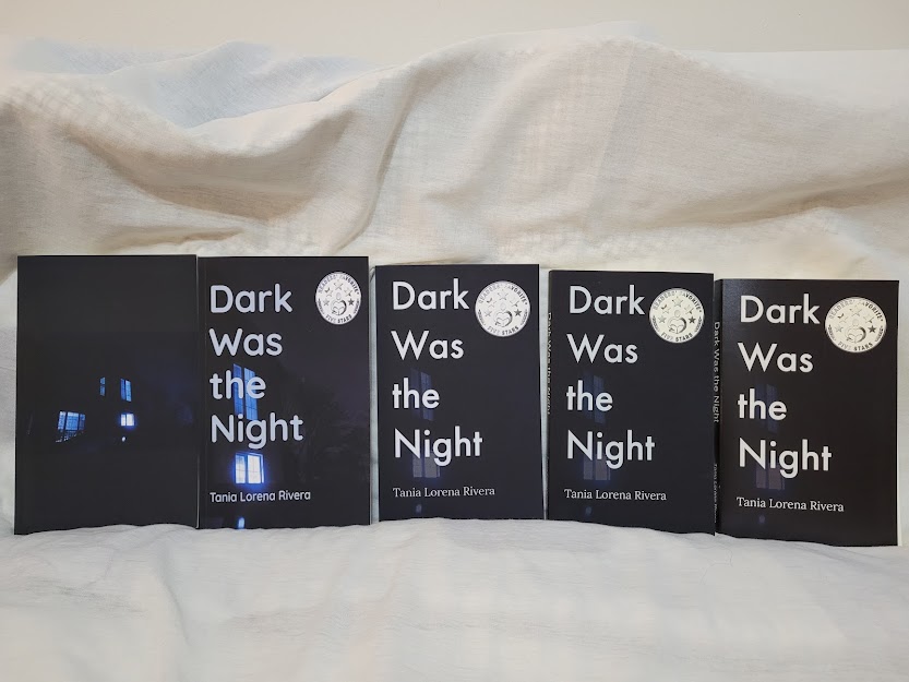
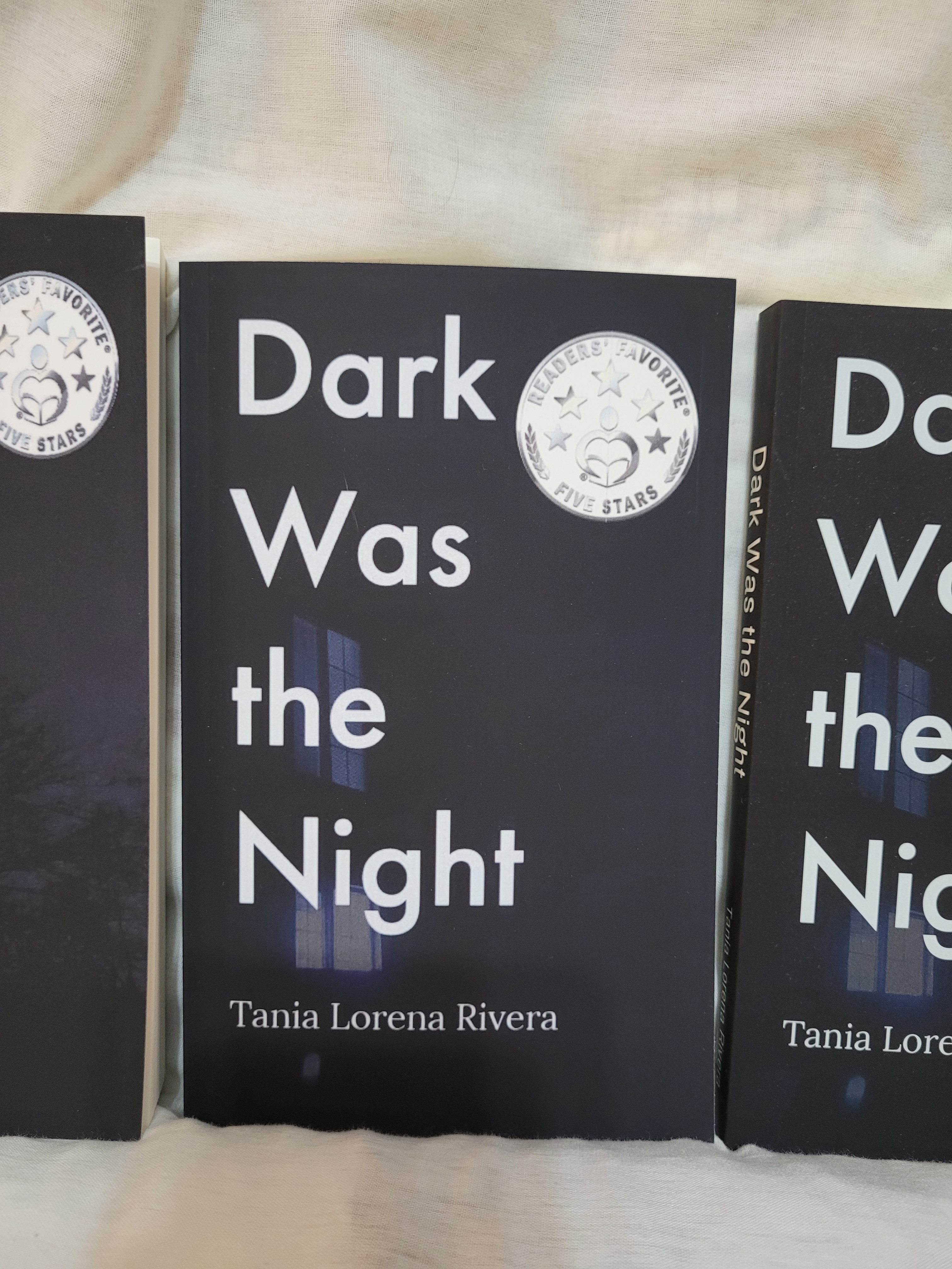
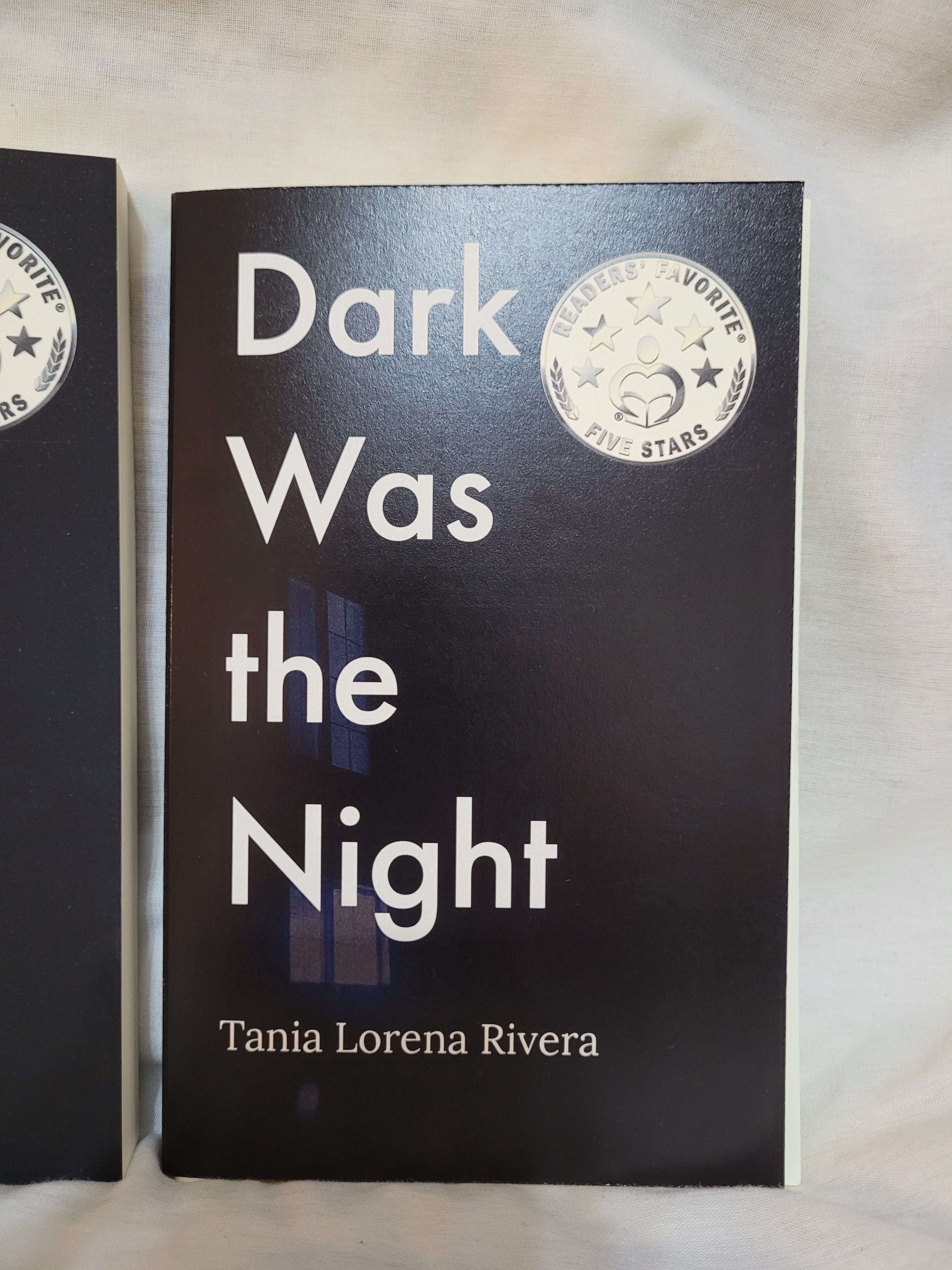
I searched for a printing company with a good quality/price ratio in my hometown. After a few days, I found this little press above a viaduct with no place to park around. But their inconvenient location was soon made up by their print quality! Far better than Amazon and Barnes & Noble. My book looked professional and gorgeous. They were a dollar more per book than what Amazon charged, and their delivery time was 6-8 days, whereas Amazon was three weeks. It was perfect!
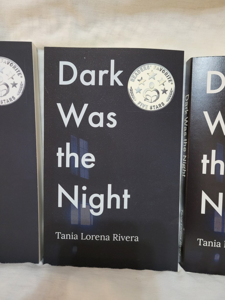
I had the choice between a glossy and a matte finish. I liked the glossy because it immediately catches your eye, but it breaks more easily. I settled for the matte finish, even if the colors were not as bright. I think it fits the genre and the smooth texture of the cover is pleasant to the touch. It was more expensive than the glossy one, but after reading articles on the matter, here’s what I found. You go with a glossy finish if you have a beautiful art design on the cover. The colors will pop out more. You go with a matte finish if you have anything else than a beautiful design on the cover. Or, you can go with whatever gives you joy, like Marie Kondo says. No one reached a clear consensus on this. Sorry, I can’t be of any more help if you are in the midst of this hard decision. You can always order two proof copies of each and see which one you like best, and to hell with mainstream ideas.

I ordered 10 copies to start. They are all gone! Each one of them is in bookstores or in the hands of clients already, and I’ve placed the order for 15 more.
Here’s hoping I won’t have to make any changes again. Unless it’s under a publisher’s advice! *wink, wink*